During my downtime I wanted to learn a few different techniques and frameworks. One thing that has slowed me down in the past has been setting up shell projects just so I can practice specific skills. Frontend Mentor has been awesome for this. It’s a site that offers a variety of free designs for developers to implement. With one click, you can download some starter code with all the necessary assets, so you can just get to coding.
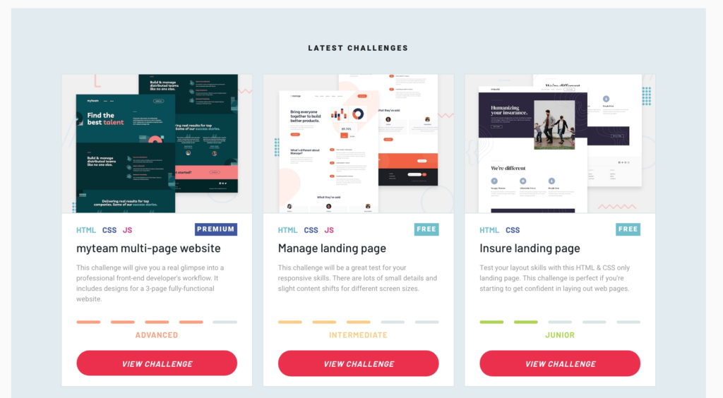
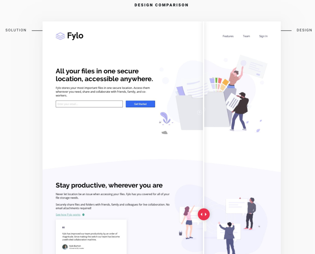
The projects are mostly free, but if you want things to be pixel perfect, you can purchase the Sketch file for the design. It’s like $5-9 per project, depending on the complexity of the design. When you’re done with the challenge, you can submit your “solution” to the site – both a live link to the working site and a link to your GitHub repo. This is where it gets super cool. After you submit your code, Frontend Mentor generates a comparison of your work with the original. It also generates an accessibility report that alerts you to any issues.
Your solution is posted live on the site, and you can have other folks in the community give you a code review. Seeing so many different approaches to the same project has been really inspiring.
What I’ve been working on
So far I’ve completed two of the easier challenges, just to get started. I’ve been working in React Native and thus exclusively on mobile designs for the past year, so it’s been good to flex my muscles and get back to writing responsive code.
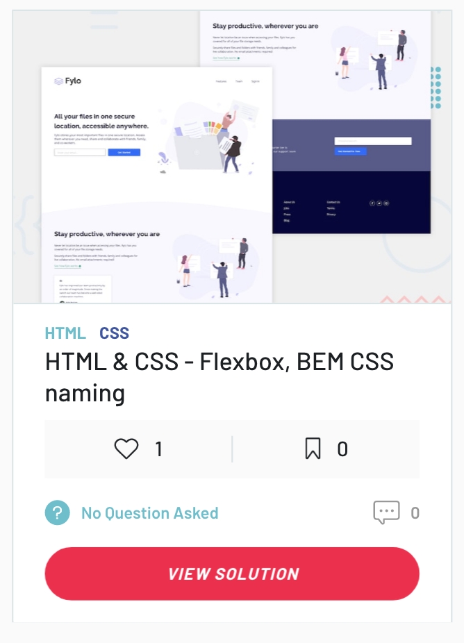
Even though the design is just a simple landing page, I still learned a lot from pulling this together.
- One mistake I made is that I didn’t work mobile first. Upon reflection, the mobile designs were much simpler than the desktop designs, so it would have made sense to do the styling for mobile first, and then add on from there with media queries.
- Since this was a small project, it was a good chance for me to practice implementing BEM naming conventions for my CSS.
- I wanted my version to match as closely as possible in the design comparison, so I paid the $5 or so for the design file. It seemed worth it to support the site. Since I don’t have a Sketch license yet, I also got to use Figma for the first time.
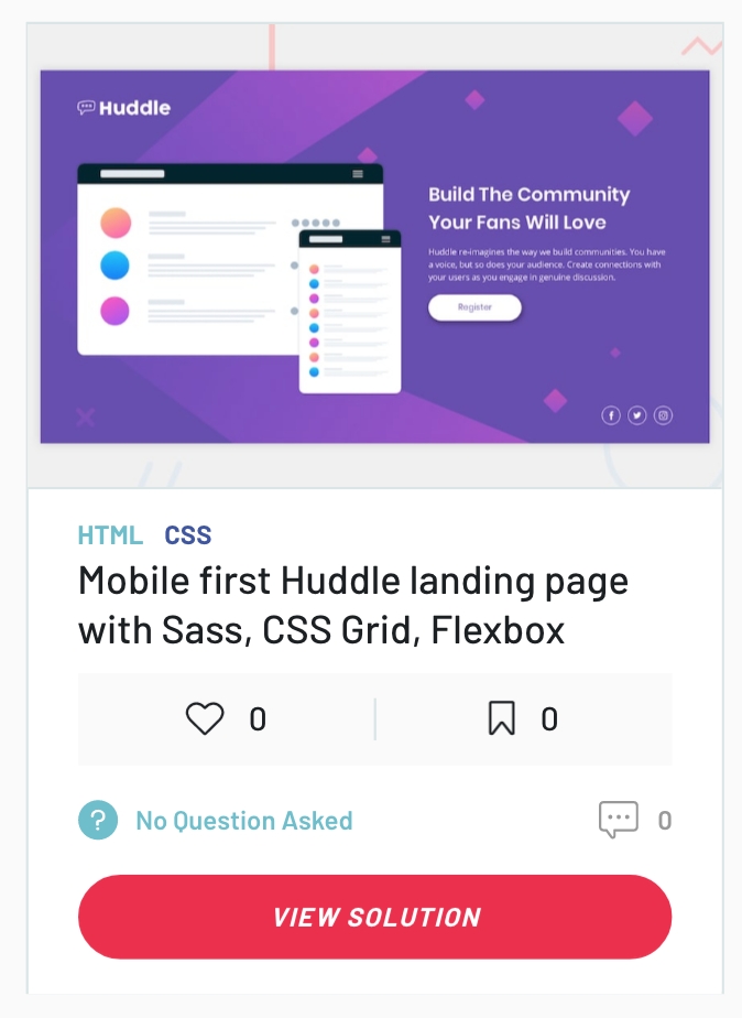
This quickie was good for:
- practicing working mobile-first (learned my lesson from the previous project 🙂 )
- installing Sass from scratch (never actually had to set up before)
- doing a little CSS Grid.
- I also learned a bit about accessibility. I learned that the new HTML5 semantic tags have landing anchors, and also that when you nest heading tags underneath each other they should be exactly 1 number below in order to indicate their hierarchy. Basically I learned how to add more meaning to my code.
I didn’t bother purchasing the Sketch file for this challenge. There was no design available for tablet, only mobile + desktop, so I might go back and clean up the responsiveness for that in between width. The text can look a little squashed around 600px. Probably should just increase my breakpoint.
What’s next?
I’m definitely going to go back to the two previous projects and clean up the responsiveness of the image sizing. After that I’m going to pick one of the more complicated challenges in order to try out Vue.js. Been curious about it for a while. 🙂